What happens when you force college journalists to publish a newspaper with no computers?
Well, first they freak out. Then they get their hands dirty.
They write stories on manual typewriters and copyedit them in pencil. They shoot with film cameras and process the prints in a makeshift darkroom. They lay it all out with pica poles and proportion wheels. They paste it all up with X-Acto knives and rubber cement.
And they love it.
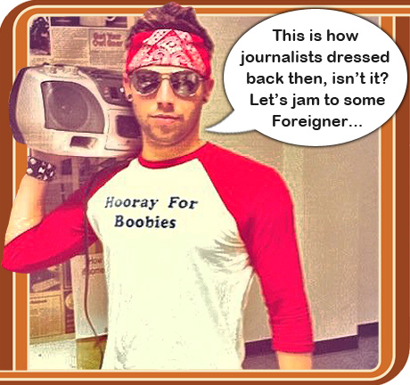
At least, that’s what’s happening right now at Florida Atlantic University. The student reporters, editors, photographers, and designers have turned off the newsroom iMacs and stowed the digital cameras – and they’re publishing their final issue of the summer on machinery that’s older than they are. A few of them have even dressed the part. Well, in their warped interpretation of ’70s and ’80s fashion…
The obvious question, and one I’ve been asked out of both curiosity and contempt, is: Why go backward? Why paste up when you can paginate? Why suffer when you can surf?
Or as one journalism professor sneered at me on a listserv…
What does it prove? What does it solve? Does it improve journalism? This is just a bad idea. But apparently some old folks can throw some $$$ at it, so all is good.
He’s half right: The Society of Professional Journalists threw some money at me, and we’re all having a good time.

It’s the debut of a new program about old-school journalism called
ALL ON PAPER. I replied to the pessimistic prof with some questions of my own…
1. J-schools teach History of Journalism, so why not live it for a couple weeks?
2. These days, we obsess about technology and don’t always focus on the old-fashioned skills of writing, reporting, shooting, and designing. Remove today’s tech, and guess what’s left?
3. For Christ’s sake, what’s wrong with having a little fun?
Or as editor-in-chief Gideon Grudo told me…
Retyping a draft for the third time because you can’t get past the first sentence without screwing it up is annoying. And today one of the ribbons on a typewriter stopped working. But no one has left or gotten antsy. We’re all working together. If this momentum continues, imagine what we can accomplish when our iMacs, HD cameras, and Google are given back to us. I think this project has single-handedly exposed us to the power of what we’ve had all along – and what we’ve completely taken for granted.
By the end of the week, the students will wrap up their computer-less issue. But right now, they need your help. They’ve designed two covers – one serious and one amusing – and they’re torn. Which should they run? Here they are (click to embiggen)…
Have a preference? Leave a comment. The staff will meet Friday afternoon to choose, and your persuasive remarks will be read aloud.
Next week, I’ll show you the entire issue, share the gritty details – and explain how you can borrow our ancient equipment so you can do ALL ON PAPER all by yourself.


I’ve been to Korezky’s design seminars and he always says MORE FACES ON THE FRONT PAGE!! so I say rock the second one. Both are banging tho.
I actually like the first one better.
Same here. Might be me or the screen shot, but I didn’t know the crowd was gathered around a typewriter until I looked really close.
LOVE the second one, brilliant!
My vote is cover #2. I think whatever opportunity you get, you must show readers the real faces behind the magic. I think the headline needs some work, though – OMG and WTF are definitely not retro. And there’s some irony in the fact that you’re using the internet to ask people their opinions on a computer-less issue.
I am so excited to see how this issue turns out! After hanging around the first day of production, I was so impressed with how the staff handled the stress of learning “old” technology. It was great to see everyone working together, it felt like a real newsroom.
I like the first cover — I think it’s more unique and while serious, is also more intriguing. The seconds is fun but also seems silly and takes away from how cool this project is and what it truly represents. I also think the photo looks obviously staged, yet (as others said here) it’s not immediately clear what’s going on when you glance at this in a bin. You’re more likely to grab someone’s attention with the first cover.
Great work with both, I’m sure this issue will be awesome!
There is not enough humor in journalism, in life and especially in college. Go with the second choice. I could easily tell it was a typewriter. As for the headline, Mr. Chase, if it was not intended to be ironic (today’s terms for yesterday’s news) then the students are accidental genuises.
I vote for the first one. The concept for the second is cute, but is that really what you are going for? Is the issue all about how you struggled with learning how to use a typewriter? I’m guessing not. While I don’t necessarily love the headline on the first one (who is going to read something headlined “old news”?), I like the concept.
Way to go Florida Atlantic Students! This all brings back memories for me. I like the FIRST ONE. There is so much you can do with the words “OLD NEWS.” It’s exactly what you wouldn’t expect from a newspaper and the typewriter as art sends the message– it’s not about the technology, but the news itself.
This a wonderful project. Thanks for inviting readers like meto weigh in on your final front page.
Great project! My students’ eyes glaze over when I start a conversation with “Back in the day….” I’m so glad these kids have had this experience, if for nothing else, the historical lesson. I prefer the first page one as more representative of the project itself. The group shot is fun, but doesn’t tell me much. Maybe the reactions are not as dramatic, or looked more posed than necessary. Those are not WTF faces in my mind. The dominant image of the typewriter is much more compelling.
From someone who’s been there and done that.😉
Personally, I like the second one. It grabs my attention a little more than the first and I always like some great humor.
Thanks for giving us the opportunity to give some input.
I vote for #2. The visual of the staff huddled around a typewriter, trying to come to grips with an antiquated technology speaks volumes. I actually like the headline. The staff is not pretending to be journalists from the 1970’s, they are journalists of today using 70’s-era tech to publish an issue. It has a sort of a “Bill and Ted’s Excellent Adventure” vibe to it. Righteous dudes traveling through time to set the course of journalism on the right path (good luck with that). About the first option, I feel it may lead readers to believe that the issue is a compendium of old articles, which is not the case. All in all, this is a great concept and I wish you the best.
I vote for the first one because I “get it” quicker. I would look for a way to include some assurance on the cover that the news inside is actually new news. Some readers might think the whole thing is news from the ’70s. But if your readership is pretty loyal anyway, go with either one and enjoy!
Compromise: Take the first pic and put it under the second headline. Still works if you redo the subheadline alittle.
It bugs me that OMG WTF screams technology — I don’t remember seeing that until texting came into our lives. I was going to suggest the opposite of the last post. I think you need to use the 2nd pic and the first headline or a different headline altogether.
The first design is cleaner and clearer than the second, and though the anachronistic acronyms are amusing for a moment, the impact isn’t as great and people will consider this a joke issue, rather than a seriously fun experiment.
I like #2. The people in the photograph provide more “action” than #1. And of course you are creating the newspaper old style in a new world, thus the texting language. Can’t wait to read it.
Well, if you really want to be retro, OMG WTF? would mean little to nothing to someone in, say, the 1970s. Not to mention that most papers – even college papers – wouldn’t print that 40 or so years ago. So if you’re going retro, gotta go with Old News, though I agree with Alex Schraff that the headline might “lead readers to believe that the issue is a compendium of old articles.” BTW, back in the day, I don’t ever remember using a word such as compendium in a news story.
If you want fun, go with #2.
What do you want to say? It’s your decision, not mine or any other adviser’s. And I advise you not to rely on this popularity contest to make the choice, either. Be bold. Be brave. Lead! Lead us back into the days of Saturday Night Fever, disco and Stayin’ Alive. Lead us back to the days of Jimmy Carter and Billy Beer and attack rabbits. I can hear the theme song now for journalism: “I Will Survive!” (Look it up. October, 1978. Gloria Gaynor)
Swartz
#1.
You got some deep analysis there, newsroombuzz. We were asked to comment not just vote. I go for #2 because it’s got students in it. But I recommend putting #1 inside the issue with a note explaining how it was one of two choices. That would be interesting.
I’m not sure what the OMG and WTF (or any other close to profanity) adds. Go with the other one. Bill McCloskey – certified old guy.
#1 with #2’s headline: OMG WTF?
And we did NOT dress like that kid with the boom box (but we did smoke in the newsroom.) Pretty amazing we put out a paper every damn day without a single computer. .
I say go with the first. The second headline grabs the reader but misses the point with its text message.If you want a staff member in a photo put one person at the typewriter above. Newspapers are about news, not reporters, though this is a special case. I still have a manual typewriter, pica pole and reduction wheel, so when the world crashes I’ll have those my grandmother’s treadle Singer, my garden and my four chickens, so I’ll be able to do some stuff if I don’t succumb to life in Texas sans AC. Kate McCarty
Although I worked with all those tools in the ’70s, I like cover #2. I think it will appeal to students and make them want to pick it up.
Number one … clear message. Congrats to all of you … What a great experience!
I definitely like the first one better. It really does look retro … and I think that’s what you are going for. The second one is too much about you all and not the product. I hope you had fun with this. I get nostalgic thinking about your experiment!
I like photo No. 1 with headline No. 2. It says to me, OMG WTF is that machine? And what do you want me to do with it? Which was, I’m sure, the sentiment of the day.
The first one carries the theme. The second one blows it.
This is a great project from both cultural and historical perspectives. There is no reason to make this overhyped or hyperbolic. Let the work speak for itself, which is what the first cover does.
And the use the other cover inside somewhere like a poster. No reason to waste the good work.
Or, you could print half your print run with cover 1 and half your print run with cover 2. My guess is that you will find the staff, faculty and old timers who actually remember exactos and pica poles with like the first; and you crazy kids and all your friends will like the second. Sports Illustrated prints different covers for different regions. Why can’t you print different covers for different generations?
I’d use the first one. It just communicates quicker. The photo immediately places us on the timeline. The headline teams cleverly with the image to communicate the concept. And the supporting text hammers it home. Besides, I think there is already an element of humor inherent in the overall project😉
You guys did an impressive job! They’re both actually quite good. Can’t wait to see the full edition.
I vote the first one. Looks like you guys have done an awesome job
I don’t think there is even a close contest here. The “OMGWTF” is the antithesis of what you are trying to do (although I recognize the attempt at irony and the hoped for humor)
To maintain the spirit of the project I would definitely choose the first although I might change the headline to incorporate the sentiment of the second. For instance, treat the typewriter as an alien or strange entity that students were forced to sniff around like Neanderthals and the wheel. So maybe use the second photo with a different headline as some others have suggested. (“Where’s the plug?” “Students Dazed and Confused”
very 70s or “Students Unplugged” “I don’t know about this…”) My headline chops are a bit rusty but you get the idea. Personally, I LOVE the graphic with the typewriter, phone and camera that K used up above. It says it all, The Way it Was This issue published annually manually.
Hey fellow UPers,
Three things:
1) How’s it going? I hope Student Affairs isn’t being too oppressive controlling these days. (If they are, give me a call.) My new title may mean I’m not physically around as much, but remember that I’m always with you.
2) Fuck what everyone else before me has commented except for eight: Boyet, Shonk, Puckey, Simpson, Swartzlander, McCarty, Kathy, and Buzek. Theirs are the only comments that hit on what your job really is here.
I don’t care which cover *you* (or any other one commenter) likes better. This decision, as always, is about picking the cover you think your readers will be more likely to pick up. (As a secondary consideration, you should probably take award-winning likeliness into consideration too.)
3) For what my opinion is worth, a hed that makes me think the issue contains dated news run above a photo of technology I’ve not used since middle school and a pair of bear claws does *not* compel me to pick up the issue, even though they’re the strongest bear claws I know.
So if I were EIC, I would definitely rule out the old-news-plus-bear-claws combination. But that still leaves you three options to pick from…
Love, truth, and reporting,
Karla
These students are doing so well with this, but I think “OMG WTF” is simply trashy and dumb. I worked with them all day the first time around, and while they definitely used their fair share of expletives, they shouldn’t feel compelled to plaster that on the front page. Keep it classy, guys. You’re better than that. While I like the idea of a stupified staff photo, it’s obviously staged. I find it hard to believe that out of all the photographers there, no one caught a natural moment of unease.
So, yes, #1 FTW (See? I can use acronyms, too).
“oppressive *or* controlling,” rather
Student journalists at Florida Atlantic University are in the midst of a grand experiment in good ol’-fashioned journalism. Through some funding from The Society of Professional Journalists and under the direction of beloved-former-adviser-forever-guru Michael Koretzky, staffers at The University Press are putting out an issue sans Internet, computers or high-tech tools of any kind. […]
I’m a big fan of the simple retro design. Although the other one is very amusing, my real reasoning is if this were your normal (electronically produced) product, I don’t know that running an “OMG, WTF?” headline would ever cross your minds. So, from a ethical/taste perspective, I vote for numero uno. However, the humorist in me sort of really wants to see that second one run somewhere, maybe as the back cover or in your opinions/editorial section, with a little pull-box explaining the conundrum between the two covers. Plus, stats from this comment section could even be included, as well as a description of the irony in incorporating new media to produce a retro paper. Very cool, though, FAU staff. As the Opinions Editor at The Pendulum of Elon University, I am inspired and impressed.
I think I like the second one because it combines the old with the new; how now days even journalists use acronyms to get our point across and how it has become well accepted in our society. It tells a lot about how technology was, what is has become and how it has changed us. With that said, I think the WTF should be replaced with a more tasteful acronym. Keep the OMG!
OMG WTF
I like the Old News head with the OMG photo …
Per Mike’s request to the writer’s group, here’s my thoughts. Which cover you choose depends on what you think will catch more readers’ eyes.
The photo in the first cover is more eye-catching. The second photo is too cluttered and it looks staged and it’s difficult to immediately note that everyone is staring at a typewriter.
On the other hand, the OMG WTF (while definitely not retro-inspired) headline is also eye-catching. So my vote is to go with the first photo and the second headline.
I also think it would be nice to include the photos of the staff so why not put it on the back cover. That way, if someone tosses the paper down and the front cover isn’t showing the photo might make someone curious enough to still pick up the paper and read it.
Either way, good job! It was a fun article to read.
Maybe because, as Mike can testify, I’m an old fuddy-duddy. (I mean who even uses THAT expression any more? But more to the point, “OMG, WTF?” is not so NOT retro, it doesn’t mean anything to the reader. I doubt if she or he cares how you produced it, if you had to draw it in crayon or carve it in stone as long as the finished product is what they expect your paper to deliver in news, opinion and art. I would guess the the “OMG, WTF” is more of the hed writer’s opinion of the process, which is of little interest to the general reader, even though I agree that it is a great excercise in what the history of prepress was like.
Besides, if (say a hurricane strikes) something happens to power on campus, or students are restricted from non-living space for their own “safety,” with these now-primitive tools, the paper could be put to bed from someone’s living room. (Probably Mike’s, if I know him.) I am assuming your printer would have a generator backup.
BTW Mike, I don’t know if you were with us in the past when we faced some power failures and had to do just the above. After the first time it happened, we prepared an emergancy “kit” that included flats, X-acto knifes, glue sticks (hard to store a waxer for that). proportion wheels, etc. Then the next time, we were ready to go.
Since then, a couple of years ago, we were able to afford to purchase a large generator that automatically kicks in after x minutes.
Great idea. I also think J schools should still teach the basics of typography. Even with the ease of design on a computer, the basics of type relationships are the same, except you can more easily kern and things of that nature. But I wish more basics were understood.
I like them both, although the second one is somewhat Murdochesque. I guess that’s okay, as long as you’re not hacking anyone’s phone lines. The old timer in me prefers the first one. Front pages, however, should catch the reader’s attention, and the second one definitely caught mine.
Great project and best of luck!
I prefer the first front page. It’s more focused and less cluttered, and the 21st century abbreviations on the second version seem incongruous. Either way, this is a truly wonderful project. It will teach some millenials that they can produce a newspaper even if their electronic equipment goes away. Think hurricanes. If you’re without electricity for a week or two, having a manual typewriter around can be a godsend — if you also have a fresh ribbon with plenty of ink on it.
LOVE THIS CONCEPT! We DO spend a lot of time focusing on technology, rather than on content. Back in the day, when I taught layout and design, I made students actually use paper and pencil to hand letter type to get a better idea of what typeface to choose and why. (They hated it!) Today’s students (aka tomorrow’s journalists, designers, ad execs and PR practitioners) should gain a better understanding of WHY we do things and WHAT they mean, rather than just HOW. Kudos to this program! Oh, and I like the first cover design better (the OLD NEWS version).
I love what you’re doing with this course idea, Koretzky, it’s genius!
I vote for cover #1 because:
* It’s more focused (the viewer gets the idea fast);
* It makes the reader do a double-take because of the oxymoron;
* It puts the typewriter where you can’t miss it.
I look forward to reading the issue!
I’m posting this page to my FB page and also to a FB group of colleagues who were fellow daily newspaper reporters with me a long time ago at one of the first NJ newspapers to have computers.
Both covers are creative, but the first one is sharper. The few words on the page quickly convey the message. It takes a minute to understand the second cover. Have you thought about using both? If you don’t have an ad on the back page, use the second cover and tell readers you couldn’t decide.
Great project. I still have my pica pole and proportion wheel. Maybe we’ll give them a spin this year at Texas State.
The second one for sure. Young people gathered around a typewriter can only be staring at the device itself. WTF is that thing?
I also think the headline is perfect. Modern linguistics applied to and through antique media tools speak volumes about what is happening to our language even while the ease of delivery has improved a thousand fold.
I hope you’ll publish the URL
where we can all see a PDF of the finished work.
A writer from the old days.
i vote for the serious front page
I vote for Old News. It reminds me of the “Man Bites Dog” headline. I just think it’s punchier, and, as a former cops reporter, I like the knife reference.
But I think you kind of lose it w/ the photo of the typewriter. As others before me have said, you want people and emotion in your shots. And although the group photo is a cute idea, it’s cluttered. Is it too late to shoot a cover shot of just one stupefied student staring at a typewriter? I wouldn’t even mind if it’s staged — the whole production has been a staged process, in a way, so I think it’d jive just fine. Anyway, that’s what I say would be the ideal.
Also, I agree w/ some of the others: include the second-place cover somewhere inside. It’d be, like, so meta. And I like that. Or else slap it a website. Even MORE ironical.
Great, great idea. Hope you’ve all had a good time.
Nice work, guys! I am really impressed with how you stuck to it. Analog ain’t easy.
I think the first cover is actually more interesting. We’re not used to seeing typewriters these days, and it’s a stronger image. The old news headline is pretty clever too.
Can’t wait to see the whole issue!
Though the second cover was funny, I think the first cover was more striking and direct. I especially liked the tagline “Darkrooms, typewriters–and knives.” That made up for the humor that was main focus for the second cover.
Great job to everyone who worked on them!
My first impression was that I liked the second cover better — I got right away that the kids were gathered around a typewriter. But I agree that the photo is a little cluttered, and I’m not that crazy about OMG WTF? as the hed. It just seems too cutesy.
The first cover seems too boring to me as-is, but I think it might perk up with a new hed: “Old School” or maybe “Kickin’ It Old School.” The subhed maybe could be a little bigger, too.
Great project. I hope the issue includes an article about the project itself, why the staff opted to go old-school for production of this issue, and what they learned from it.
And, yeah, my first college journalism class had typewriters — manual, no less. You really improve your touch-typing skills when you’re forced to work on a manual. We had ratty old VDT computers for the newspaper, but production was all wax and Xacto knives until my senior year when we got new computers.
My vote goes to cover #1. The close up pic of the lone typewriter is a simple visual, more in keeping with the retro theme. Draws the eye and blends nicely with the text. Cover #2 is nice, but using internet slang, WTF, sorta nixes the project’s flashback vibe. Either way, this is excellent work and as we used to say back in the day – keep on truckin’
If you want anyone to notice the issue….#2 has my vote. Eventually they will see that old contraption everyone is looking at but that could take days! Grab them with a headline they relate to and you at least make them stop to think about picking it up. Besides, who needs serious in this serious everywhere you look world? What we need is a way to get them to think and how better to do that? OMG IDK!
Michael, your request brings up a question that the media often faced before it lost the war to Internet news: which group to appeal to – the OMG generation or older readers? If you decide on cover #1 (which I prefer), you might enlarge the” retro” edition reference in hopes that “retro” would appeal to several sets of readers – the young who call it “retro” and others who simply see it as their past.
Bravo to applying the OMG perspective to old-guard journalism. Can one truly enter a time machine when the newsroom was a world of clacking Underwood and Royal typewriters? Of editors wearing visors under flourescent lights? Of research libraries with musty sepia-colored clip files?
Perhaps, after 2012, when the world vanishes and computer memories are destroyed, a new species in another millenium will dig up this novel edition and marvel at the newspapers of 2011. God knows it will be hard to find a working newspaper anywhere else
Power to the people!
Definitely choose OLD NEWS. (It pertains to your method…and is credible.)
The “funny” front page is entirely non-journalistic in attitude (not to mention use of language that wouldn’t be printed in most newspapers today).
Idea: A dying profession doesn’t need to run off the “older” crowd who still value journalism as something that publishes with a sense of caring about the welfare of the community at large … that cover surely doesn’t reflect concern for anything…in my humble opinion. Journalism will die if it becomes just a personal playground of “journalists.”
1. I believe Koretzky was wearing that “Hooray for Boobies” shirt when he hired me to work at XS magazine back in the 1940s. I’m glad to see it has survived.
2. Karla, you are a gift.
3. Go with the cover you think will have the most rack appeal and best illustrates the issue’s content. Trust your gut.
4. Don’t listen to focus groups.
5. Kick ass.
I say go with the first one. it immediately put me in mind of the old joke a sun-sentinel copyeditor friend used to bring up at the end of especially despairing nights: “it’s not a NEWSpaper, it’s a NEW paper.” But I’m hoping, even presuming, that in this case people will be surprised and find both when they open it.
At first, I thought Cover #1 – because it depicts the old typewriter. But then I said: Wait a minute, it wasn’t the old typewriter that made this happen….it was the people, the staff and others who diligently and courageously put their creativity, dedication, and fun spirits together to produce this final issue. Go with Door # 2 and reap the rewards! You guys rock! (I know because I have insider information!!!!)
Kudos to the students for a great job. I like #1 which is more clearly retro, but #2 will get more attention from student readers. It’s a great project no matter which one choose. Good luck!
Although the #2 headline is more “new school,” it’s the one I prefer. I learned to be a journalist under the conditions the students learned and I highly recommend it.
In keeping with the retro approach, I’d say ditch the abbreviated newspeak headline in the second option. The group photo works well with the teasers tho. I like them better than the first option. Good luck!
The second is better.
The second one with the students is way better and more enticing. But I wasn’t big on that headline. Maybe use older terminology, like “Not Groovy, Man!”
I run the Campus News chain of student papers and think this is a great idea!
I have to say I like the first one more. The reason why is because OMG WTF? is straight off a text message or Facebook and it’s been getting a little cliche there anyway. Also the text at the bottom feels a little cluttered and harder to read.
There’s just something I love about the OLD NEWS headline too.
This whole concept and project is awesome; fuck a hater on a listserv. I hope you all gleaned a lot from your participation — and from what Gideon said, it sounds like you’re on the right track.
As for which cover to choose, I do like the headline of the second one… But if I may offer my two cents (which I’m damned well about to do anyway), I’m going to let you know the photo is hokey at best. #realtalk
However, do what you will; as that’s what you do best.
Btdubz, will this computer-less issue be available online?
Go with the OLD NEWS headline on the first issue with the befuddled staff photograph from the second.
I like the first cover better. The second looks too posed, like the grip and grin photos that journalists get all the time from people looking for publicity.
This was a tough one because both covers are creative and so different from each other. I vote for the first cover because I think the subhead is catchy and descriptive. Readers will get it right away. Plus, the image will be readily seen from far away. I’m afraid the photo on the second cover has just too much going on. If I was walking by the bin, there would be nothing to grab and pull me in.
However, I’m not a big fan of either headline. I think OLD NEWS sounds like the issue will be filled with stories from the ’70s. OMG WTF is a little juvenile. I think it might give the false impression that the content is fluffy and take away from the intrinsic coolness of the project.
Either way, I can’t wait to see the finished issue. What a neat project. Great work!
Karla: you’re fucking awesome. Way to tell it like it is. Totally dig it. I can MORE THAN relate.
Let me preface this by saying that this is my honest opinion and I’m not known to withhold much. So, it’s definitely nothing personal.
First, I have to applaud the staff’s dedication to working this issue completely “old school.” Very few of us (myself included) know what it is to put together an issue that is TRULY produced in the manner it would have been before we had such luxuries like those Gideon speaks of above.
That said, while you’re all clearly hard workers, and the concept is fantastic — and should win awards — I still have to ask: what exactly is this issue about?
Is it about how you all “braved it through the storm” of working in what are now antiquated production conditions?
Is it re-hashing TRULY OLD FAU news as the first cover would suggest?
Is it a bitch and moan fest about the production conditions as “OMG WTF?” would suggest?
I don’t get it.
It’s of no consequence that WE — as journalists and current/ex-UPers — know how much time and effort went in to this. It’s a matter of what is going to make the average FAU student — who has no stake in the UP (or even knows it exists) — want to read this issue.
And I can tell you this: it’s not your hard work.
Unless the content of this issue is all about making a new paper using old methodology — for which I, again, personally applaud you all — then I still have no idea what will make me want to read it.
Thus, I have to vote for neither. Give me a reason to open the issue if I have no interest in the UP whatsoever and I’ll gladly pick.
If I am in some way mistaken, and this issue is (from a content standpoint) all about the obstacles you overcame, or what you learned throughout the process, then I pick cover one ONLY because it is more appealing than “OMG WTF?.”
Honestly, any of the Kardashians could have come up with this headline. And I know you guys are WAY better than the lowest common denominator.
What is the issue really about? Think about that and consider changing the headline to reflect the content of the issue rather than playing on the “special issue” theme and all the elements that went in to making it special. Believe me…nobody outside of that office cares that it’s special.
In my opinion, you’ll win awards not for calling what you did “special” — or at least not referring to HOW you did it (or how you feel about) in the headline — but for sticking to a content driven headline that talks about what is in the issue itself.
Just my two cents and sorry if it comes off as harsh. Make no mistake: I think you’re all winners just for taking on such a task.
Well done.
I like elements of both the covers, but if I had to choose I would go with the first one. I think it communicates more than the group photo. Most people will just glance at the cover for a few seconds so you need to grab them right away. I don’t think the second cover will catch their attention because they’re not going to know what it’s about.
I can’t wait to look at the finished product. I think this is a kick ass project and I hope that it will be replicated across the country.
Picture from No. 1, hed from No. 2. Awaiting report on whether these college kids smoked weed in the darkroom as their peers did in the ’70s. Also, I see no one wearing bib overalls and no long hair and beards on the fellas.
No. 2. It shows live people. And the headline will attract more attention.
Let me assure the young FAU journalists that they are missing nothing not having to deal with typewriters, copy pencils, dummies, hand-counted headlines and engravings — though I’ll admit it was fun to drink beer with the typesetters and compositors after hours.
— George Flynn
M.A. FAU 1975
Second is best! I think students would be more interested in picking it up over the first. The headline is what I read first, then my eyes went to see students crowded around a…typewriter! It’s more interactive to me.
I like the first one; it’s subtler.
I love the second one! People in photos are always preferable. And it’s a nice mix of the old and new.
This takes me back to my days at the college newspaper in 1982-85. But we had computers then! I did use the X-acto and wax machine on my first job!
What a great project.
As a former editor-in-chief and art director of the UP I have a special place in my heart for selecting a good cover. I love the concept of the project and the idea behind both covers… however; the second one is the clear choice in my humble opinion.
First, and most importantly… it grabs my attention immediately… the old news cover is just a bit too subtle. Getting people to actually pick up and read an issue was a tough challenge back in my day and I think the second choice is clever and striking. On the surface it may seem like a cheap ploy to run something “edgy” or “unclassy” as someone above posted but to me it’s pretty smart to juxtapose modern texting lingo which was born because of technology against a backdrop of old school journalism tools. However, I am the guy who approved of a headline back when I was on staff that read “Students get Blown” in an article for a skydiving simulator coming to campus… so I guess you can take that into account.
Second… it’s a better picture. I realize it’s staged and all but in combination with the headline I think it’s pretty successful. Also, as a number of experienced people taught me… it’s always better to have people on the cover. Usually having too many people on the cover is a bad thing but having them all stare at the typewriter guides my eye through nicely. The text layout is more successful in the Old News cover…. but the text on the OMG cover is not a dealbreaker to me. It’s an interesting case because normally you would want the eye to see a primary object (the art) followed by the headline and then the sub heads. But in this case the headline to me is a focal point relegating the art to a secondary roll.
Finally, the Old cover gives me a sense that his is news from the past… not current news presented with the tools from the past. To me that’s a pretty big distinction and I think the OMG cover walks that line perfectly.
Those are just my thoughts… I hope they help.
“Old News” is funnier, albeit in a subtle way, than “OMG WTF.” By keeping things retro, and with its bolder image (it reminds me of a fanzine), it strikes me as more cohesive than #2. Great job. You kids have been living my college life! (KU, j, 1980)
Dudes, never mind “seen,” I haven’t even “heard” the furthermuckin words, X-Acto knife since my 1981 junior year in college where I edited the Entertainment section of The Campus Echo. I say rock # 2. Both are nice. I’m feeling #2; it’s a lovely encounter — collision? —- of the old and the new.
typo: that’s “fothermuckin.”
from the new urban profanity.
pardon.
I’d go with the second. I like the juxtoposition of a paper that is SO retro having such a modern and fun head. Plus, yeah. The people.
(Also, I was in J-school in the early/mid-00s, and I don’t even have a clue how to count out a headline or paste up a page. Not that it would matter, because I can’t cut (or draw) a straight, flat line to save my soul.)
[…] Journoterrorist.com Students at Florida Atlantic University are putting out their final summer issue on machinery that’s older than they are, reports Michael Koretzky. They’re writing their stories on manual typewriters and copyediting them in pencil. “They lay it all out… Read more Share this: Tweet this! […]
You can’t be using Arial as a typeface for a “manually-designed” newspaper. You shouldn’t be using it anyway, as it is a non-typeface.
I think the second one (“OMG WTF”) works best. From a photojournalism standpoint, having faces with emotion is effective. But it also works by having a headline that on one hand gets the readers attention quickly and on the other hand is a nice juxtaposition between modern “text slang” and the old school way of producing a newspaper.
Needless to say, I believe I would have learned a lot more about the history of journalism by doing something hands on than sitting in a lecture hall being told information. Kudos for breaking out of the educational mold, even if for only a moment.
Probably would go with the first hed and the second pix … something about that hairy arm in the first picture icks me out … as does the implied profanity in the second headline — the OMG makes the same point without need for the WTF, which is conveyed by the photo, anyway.
Though I don’t go as far back as manual typewriters, I did do manual paste-up and had to master the art of the proportion wheel. I like the first one because it’s completely “old school.” However, I don’t think the readers (college students) will get it as easily as they will the second one, which is extremely clever! Can’t wait to know which one you chose.
Kudos to Micheal and the students for a job well done. Put me down for cover #2. Though I understand the argument that some make about using the first cover I think it will all be all for naught if the paper collects dust because no one picked it up off from the rack in the first place.
The OMG WTF connects with a younger audience-(which is brilliant by the way since the paper is using a retro theme). While they are attracted to the cover and then pick it they will actually LEARN SOMETHING. Isn’t this the point of the entire exercise?😉
The first one is grabbier (and more retro). But the commenters persuaded me that showing the team is a good idea. Go with #2. Excellent project. Groovy, even. I look forward to the rollout of That ’70s Tab.
Definitely number 2. With a little Photoshopping (which would be outlawed for this experiment) on the heads I could picture the staff at the Daily Collegian at Penn State in the 70s. I still remember those hulking, brutalist gray typewriters with the flying capitals.
The second one, definitely. It has the language (such as it is!) to attract today’s young readers and draw them into the story. Plus, I like the photo better.
Btw, did anyone have to use a proportion wheel for this issue, and, if so, where the heck did you find them? I haven’t seen one in a store in 10 years.
Numero dos. But don’t listen to me, I’d run WHAT THE FUCK? spelled out over a closeup of the hot-looking long-haired guy in shades typing on a typewriter. That would get my attention on both counts.
Definitely number 1. I’m not groovin with “WTF” and “OMG.” If it’s old school, we didn’t say that in the “old school.” And wasn’t it just yesterday I tossed out my pica stick and my resizing wheel? PS I still have an Xacto and an Underwood 45.
I too tossed out the accoutrements of the trade several decades ago. I wonder if they would have been worth anything had I held onto them. I likewise regretted throwing out dozens of Superman comic books when I went to university. To look up their value now would depress me I’m sure.
While I agree with the criticisms of the second cover, I still support it despite the flaws. It simply commands more attention.
Old School at the New School. Love it!
Back when dinosaurs roamed the earth when I was in college in the 70s, I had the same thoughts about learning to read hot type. You know, lead. You have to read it upsidedown and backwards in order to make an edit. I thought it was awesome going through those lessons!
Dear Joe Clark, who commented on the use of Arial in this intriguing project:
Arial is not a “non-typeface.” It is perfectly valid for these students since it so closely emulates Helvetica, which was around back then and quite common. Most careful designers have trouble discerning the slight differences:
http://www.ilovetypography.com/2007/10/06/arial-versus-helvetica
#2. BUT — with a different headline. The existing one doesn’t seem to have the right focus. It’s just a reaction to a typewriter, when really what you’re trying to communicate is what these students did, and the fact that news is inside. Real news. Hard won news. The picture itself already communicates OMG WTF?
Terrific idea!
Fun concept! I like the first cover much more.
Personally, I’d go with the art on #1 but the headline on #2. It works. Trust me.
#2 with a bullet. What’s wrong with you people? The chance to be both funny and journalistic at the same time is so goddam rare. Seize it with both ink stained hands.
Hey FAU, see how it was done back in the day as photoed by one of our former profs:
http://www.commfaculty.fullerton.edu/woverbeck/dtr5.htm
and I like #2. How often do you get to put WTF in War Ends type?
Number 2, mos def. I love the marriage of old school and texting terminology. It represents what the production of this retro issue was all about: The reaction of the new guard to the old world.
May I add that I LOVE what you’re doing here. I’m a not-so-old journalist who in the ’80s entered a poorly funded college newsroom that had typewriters, pica rulers and pasteup. At an annual competition that put us up against better-supported college papers, we’d come in hauling our huge “portable” typewriters (to the snickers of rival school reporters who had the first laptop-ish comptuers we’d ever seen). We’d drop these monsters onto the tables, and proceed to kick ass.
Rock on, I say.
Michelle Morgante, UCSB Daily Nexus class of ’91
I like the first cover (w/ just the typewriter) better. Thanks for posting about this project – Very cool!
They are both good—-but, I’d say more cow bell for sure…… or, at least, maybe some olde school styro-foam coffee cups (half filled), mugs, one of those plaid fabric ash trays with cigs and at least one cigar (sports writers), a racing forum (sports writers again), a beater dictionary, ap stylebook, a necktie hanging on the chair (tied and looped—ready to go—city editor) and maybe even an errant cap from Jack’s old No. 7 kick’n around on the desktop somewhere.
If I had to choose—-number two, but more cow bell please.
I’m probably late on this (for your dramatic newsroom poetry slam-esque reading), but…
Great idea. The contrast of the “OMG WTF”? headline compared to what you’ve done is my preferred choice.
First, great project! It’s good to know what’s behind the curtain, what came before now, and how different things can be from what you know.
Second, I would use the headline Old News (which I think is clever, funny and descriptive all in two words) with the graphic from idea #2. I like the picture and especially the little captions on that one, very funny and evocative. They’ll work well together.
When I started out doing music PR and journalism, I was cutting and pasting graphics and using rub-on transfer lettering. And my products have evolved through many phases and combinations of technology since then. Having started graphic design in such a basic way still informs my work. Another formative experience was doing font design at IBM, literally creating fonts pixel by pixel – it was fascinating to learn all the considerations that went into making the fonts I had previously used without thinking about how they were made at all. This is a great gift you’ve given your students!
Both covers work just fine. The best part of this piece of the exercise is… Look at the response you got. Look how many people care about the cover of a newspaper. Absolutely fabulous. Could this happen every day, with every paper, in every city?
Clearly, the OMG WTF cover is the one to use. As a college newspaper writer and editor for four years from 1984 – 1988, I had to put aside Thursday afternoons to literally “paste up” the paper with those wonderful X-acto knives and those rolls of newspaper border designs. I only wish we had computers back then. We could have doubled the number of stories and put in more timely articles. Hey, kiddies, kiss that office computer when you ditch this experiment.
I prefer No. 1 because the image is smart and says a lot all by itself. I feel it conveys the theme of the challenge really well. the reverse text is clear and explains a lot in few words, wheareas No. 2 uses texting lingo, which was not around yet for 19070s era writers and editors to tap. Therefore, I think No. 2 is lost in time. I love the lessons you learned from this challenge. I can hardly believe we did it every week way back when.
They are both great, but I prefer the second one.
Actually, most of those galleys were pasted up with a waxing machine that held hot wax. You ran each gallery through the machine to coat one side of it, then laid it down on a template and burnished it down with a brayer., a semi-hard rubber or plastic cylinder roller on a thick wire handle. But this process was after cold (electronic) type was being used.
Lots of us still remember the old Linotypes, whose slugs of molded lead were locked into a chase for proofing.
ROTFL. Ah, fixer in the tie. Wax under the fingernails. Good ol’ days.
[…] interesante esta idea de la Florida Atlantic University de poner a sus estudiantes de periodismo a hacer un diario como se hacía 20 años atrás. Es decir, sin ayuda digital. El resultado es un largo post, dos diarios (abajo está uno) y estos […]
“What does it prove? What does it solve? Does it improve journalism? ”
This is the line-of-thought that would have us smash every film camera now that there is digital photography; that would have us bonfire all old manual carpentry tools now that there is power equipment; that would have us incinerate our bookcases (and their contents) now that there are eBook readers.
There is something honest and pure in crafting, whether it be a dresser using a 75-year-old hand plane or a story using a manual Underwood with Pica type and a red-black ribbon. As to “improving” journalism, my own experience has shown that using a manual typewriter tends to make the final work tighter and less wordy (computers are notorious for their ability to allow writers to pile up heaps of words with little effort) … and, as noted in the article, it led to a sense of group effort and group satisfaction sorely lacking into today’s isolated, cubicle-driven work environment.
So I don’t see how it could be considered a bad thing.
Great project – kudos all round.
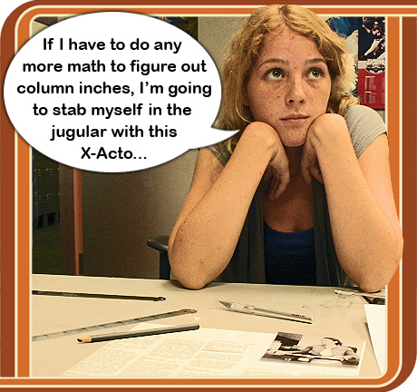
The group pic might be usable inside in a a photo-story in the style of the pic above (“If I have to do any more math…”) fun, retro and informative.
But the ‘hands’ one *is* the cover. A picture of something interesting trumps a picture of people looking at something interesting – unless your photographer is exceptionally lucky and gifted. ‘Old news’ is a far better headline too – provocative and cheekily challenging and a witty pun on ‘news’ content v process. Plus the soviet/punk/vorticist pasted-on copy is retrotastic gorgeous plus suits the photography.
The OMG WTF? headline might have similar intentions to the first but risks looking lazy and immature. Not saying that it *is*, just that it could look that way. Plus editorial question marks almost always say “Please go away because we’re weak and ineffectual and don’t know what to think.” Whether it’s a serious sceptical political periodical, an angsty battle-cry aimed at alientated teens, or a popular celeb mag, a paper cough website cough has to be serenely confident and at least look like it knows what it’s about. I’d buy the ‘hands’ one.
I like the first one because it’s more retro, in keeping with the theme. The photo and words are both period-appropriate.
second one. definitely the second one.
I like the text of the first ( typewriter pic ) cover with the image ( people + typewriter ) from the second cover.
hope you used OMG WTF FOR YOUR COVER!! from 1992- 1994 i was doing all this in journalism school at SUNY morrisville college new york. the darkroom, page layouts by hand, adding column inches..ARRRRR!!! doing math for copy preparation…
First one is classy and goes with the theme. I like the joke in the second one, but not the photo. Neat idea overall!
The second one is more irreverent, but the photo is more eye-catching and the captions are catchier. I vote second one!
Having grown up a journalist in the pica pole and 35mm film era, I think what you’re doing is fantastic. If nothing else, for the perspective. Are you all conducting interviews for the stories in person or on the telephone also? Email and social media allow subjects to “can” their responses and dilute the quotes, reducing the impact of your reporting.
I like the second front page example.
As a J-grad (U Rhode Island 1975) and 25-year ink vet, I could have a LOT to say. But brevity matters, and in this case was asked: “Which page one?” For me, the answer is reflexive, a no-brainer: “Old News.” Why? Because in my day, we wouldn’t ever consider putting filthy slang on page one — or, come to that, Lady Gaga, either. News was news, nothing else made page one. And there was no cherry-picking Drudge Report to steal our stories for its brown-shirted, advocacy-oriented “journalism.” BTW (!) it’s rubber cement on the copy “takes,” (don’t forget slug!), but wax on the back of “sticks” for the paste-down. BURN IT!
I love the picture and captions of the second (amusing) one, but it needs a new headline.
I like the OMG WTF headline — a true example of a captivating headline — aimed at your audience beautifully! OLD NEWS screams “boring” and “OLD” to me, and doesn’t do the job of drawing me in.
> 2. These days, we obsess about technology and don’t always focus on the old
> fashioned skills of writing, reporting, shooting, and designing. Remove today’s tech,
> and guess what’s left?
This seems to me to be exactly backward. The point of such technology is to automate away the tedious parts, leaving more time for the actual work of writing, reporting, shooting, and designing. “Removing” today’s technology isn’t removing anything – it’s adding a whole lot of work that could be done more easily and more effectively by a computer, but which is entirely uninteresting and peripheral to the actual journalism part of journalism.
If the technology is currently being used otherwise, something has gone very wrong.
[…] […]
Being what some call a “purist” when it comes to journalism, and now being an editor and publisher of a local website and magazine for a small community, I love this idea. I strive to teach and lead J-students of all ages that write for us and this is a fantastic way to get back to the core of the industry. You are forced to focus on the writing, the design and the process when you take away the technology and that is something that is so much more important today in our industry than it perhaps ever has been in the past. With the web-first ideologies and the “print is dead” mantra surrounding all of us, it is a project like this that encourages passionate journalists with integrity to keep going, to keep teaching and to keep producing good, real journalism.
Thank you for the inspiration.
It’s too bad Linotypes are so hard to find these days, it might actually be kind of cool if they had to cast all the type into hot metal…
[…] Ahh, the good old days. The young people of today just don’t appreciate how technology has changed the life of a newspaper journo (for the better?) nor why you’d often find a few of them a 6am knocking back schooners at the journo’s club. […]
[…] with typewriters, paste-up editing, and cameras with film- which they had to develop themselves. Part one and part two. (via Laughing Squid) * The Hanging at Mankato. The story of the 1852 execution of […]
As an elderly long-time user, collector, and repairer of typewriters I can only advise you to stay away from the WD-40. The manual typewriter was designed to need very little lubrication, and WD-40 will turn sticky and gum up the works as dirt sticks to it. The main requirement for a smoothly operating machine is that the bearing surfaces be kept clean. The carriage rails could be rubbed (not drenched) with something like FluidFilm or ProLink. The most trouble is found in the sector slots – if the key-bar action is sluggish, those must be cleaned with a solvent. They are designed to run dry and clean – but the design allows dust and crud to fall into them.
The first one! Nothing says 1970’s newsroom as much as hairy arms and analog watch. I should know, I was there.
Bravo! Nothing disciplines your writing like the need to think in terms of column-inches. And the old-school production reminds us that journalism is best practiced meticulously, as a craft, not with the attitude that anything can be redone with a few clicks.
[…] about the ALL ON PAPER project at Florida Atlantic University, and how “student reporters, editors, photographers, […]
Both are wonderful! My pick would be Number 1 for Front Cover but I would include Number 2 group shot somewhere inside if I could because it is so funny and it is satisfying to see the whole team.
Both are great. #1 is more sophisticated and subtle. #2 will capture more student attention and, perhaps, best illustrates the struggle between old and new.
I think they are both great…but I like the second one better. It captures the panic you must have felt when given this assignment, and I expect you give the pros of it in the article….
This really brings back the memories. I used to develop my own photos in a darkroom; I loved the smell of those chemicals.
[…] universidade norte-americana passaram pela experiência de fazer um jornal old-school com o projeto All on Paper. A proposta foi fazer uma edição especial do jornal estudantil, só que sem utilizar recursos […]
[…] about the origin and beginning of the experiment and details of the experience. Eco World Content From Across The Internet. Featured on […]
Use the second one; coming from a 51 year old female who has read practically all facets of print. I think it assuredly stands out more.
[…] about the origin and beginning of the experiment and details of the experience. Eco World Content From Across The Internet. Featured on […]
[…] What happens when you force college journalists to publish a newspaper with no computers? Well, first they freak out. Then they get their hands dirty. They write stories on manual typewriters and copyedit them in pencil. They shoot with film cameras and process the prints in a makeshift darkroom. They lay it all out with pica poles and proportion wheels. They paste it all up with X-Acto knives and rubber cement. And they love it. At least, that's … Read More […]
First one, for sure. And great idea for a project.
[…] I admit I was skeptical of the exercise from the beginning. My new media/get off my lawn hat was on tight. But I do see a deeper desire that surfaces from this type exercise. […]
[…] resoconto, anzi i resoconti sono sia illuminanti, per noi tecnonati, che nostalgici, per chi per anni ha lavorato così (ma in […]
[…] alla Florida Atlantic University, un paio di sabati fa, quando abbiamo iniziato il progetto ALL ON PAPER. «Anche questa è sfasciata» ha gridato un altro. «Non sono rotte» ho detto. «Le macchine per […]
[…] How to have a paper ball […]
[…] foi a proposta do projeto All on Paper. Para criar um jornal impresso, estudantes norte-americanos de jornalismo não puderam usar novas […]
I liked as much as you’ll receive performed right here. The comic strip is attractive, your authored subject matter stylish. nevertheless, you command get got an nervousness over that you would like be turning in the following. unwell no doubt come further previously once more as exactly the similar nearly a lot frequently inside case you shield this hike.